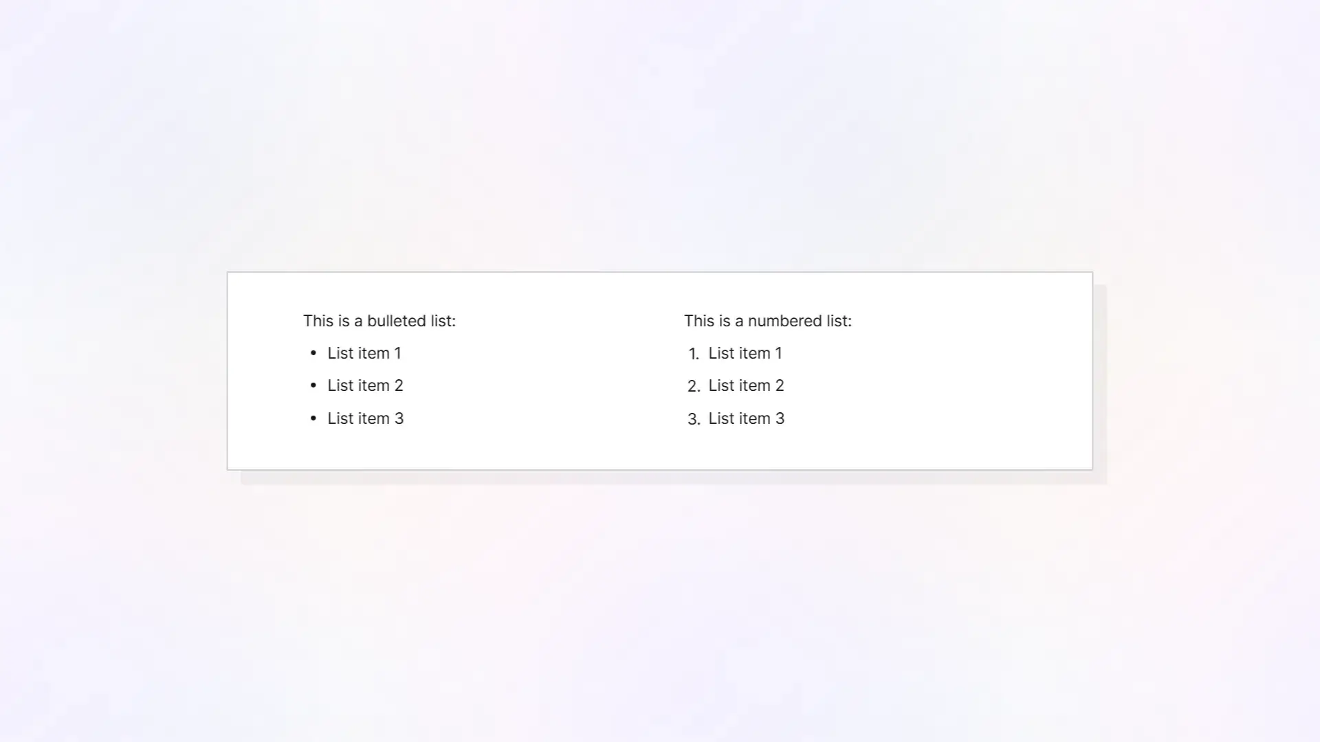
Bullet List Item Blocks
You can always click the Plus icon next to a block to change the block type, but oftentimes you may want to change the block type using keyboard shortcuts. To create a bullet item block type, simply type an asterisks * and press space to change the block type to a bullet item:

If your cursor is within a bullet item block type and you press Enter, a new bullet item block type will be created automatically:

By typing additional text, the second bullet item is maintained. However, if there is no text next to the bullet and you press Enter again, the block will be converted back to a paragraph block:

Numbered List Item Blocks
To create a numbered list, type any number (integer) and press space, and the block will be converted to a numbered list item:

Pressing Enter at the end of a numbered list item will create a new numbered list item block type and the numbered value will increment up by 1:

Similar to bullet lists, if you press Enter within an empty numbered list item, the block will remove the recent increment and convert to a paragraph text block.
Quote Blocks
Type /quote and then press Enter to create a quote block item.

Quote blocks are used to display written quotes. The indented text with the vertical line is a common styling to indicate the text is a quote from another person.
Checklist Blocks
Type /checklist and press Enter to create a checklist block item:
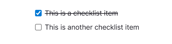
Like bullet lists and numbered lists, pressing Enter at the end of a populated checklist block item will create an additional checklist block item underneath it. This is helpful for when you need to create numerous checklist items in sequence.
Checklist items are interactive in that you can click the checkbox to mark it as completed.
Toggle List Blocks and Toggle Heading Blocks
The Toggle List Block and Toggle Heading Block function almost exactly the same. The only difference is that a Toggle Heading Block matches the size and styling of other heading blocks, such as H1, H2, etc. blocks.
To create a Toggle List Block, type /toggle and press Enter, then type some text for the parent block of the toggle list:

Then click the triangle next to the toggle list parent to expand the empty toggle list:

The parent toggle list is now expanded. You can now select the child-block of the toggle list and add any kind of block content to any number of blocks underneath the parent toggle list block:
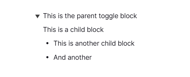
The toggle list is another interactive element that shows and hides its child content. Click the trinagle next to the parent to hide the children:
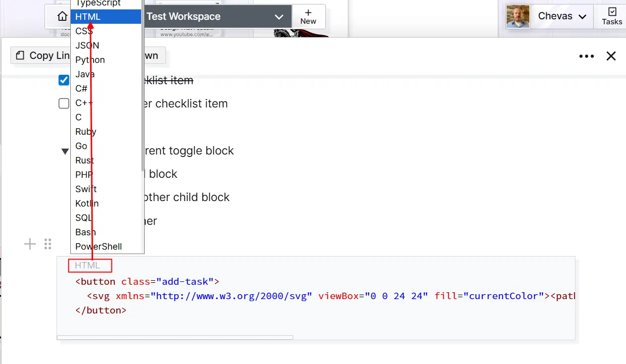
Code Blocks with Syntax Highlighting
Code blocks are used to display snippets of code, or plain text. Type /code and press Enter to create a code block:
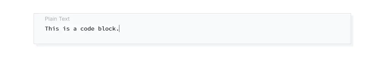
Depending on the type of text that’s in a code block, you can change the type by clicking the light gray “Plain Text” element, which will bring up a selection menu, and then change the type to match your code. In the example below, HTML was pasted in the code block, HTML was selected as the type, and the result is syntax-highlighted HTML:
Tables
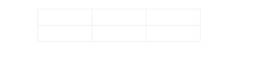
To create an inline table, type /table and press Enter:
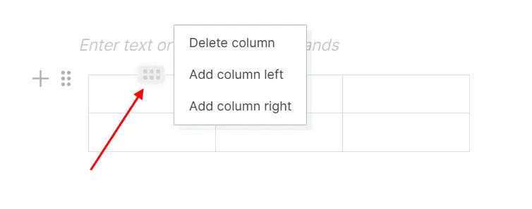
Hovering over a table (or clicking inside of a table) will display 6-dot icons in context, for rows and columns. Clicking these menus will allow you to add additional columns or rows, or delete the selected column or row:
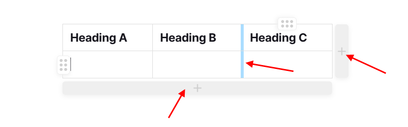
You can also easily add additional rows or columns by clicking the areas beneath or to the right of the table. In addition, by hovering over a vertical line, you can change the width of any column:
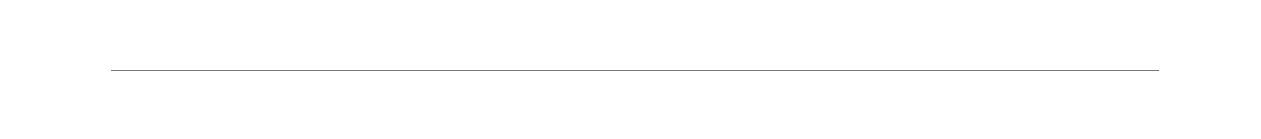
Divider Block
Type a dash - 3 times to create a divider:
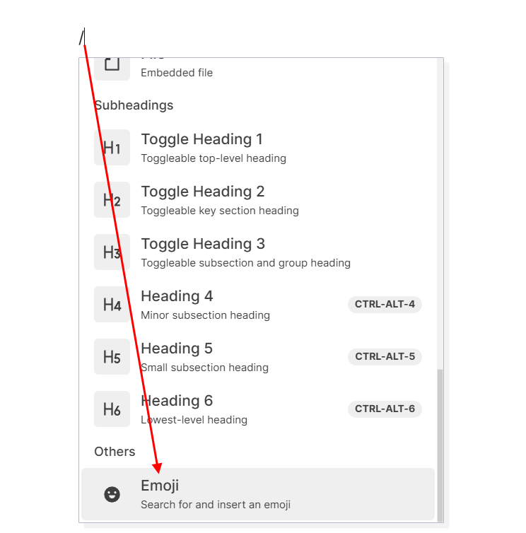
Emoji Selection
Emojis are inline text objects. Type a slash / and then select Emoji:
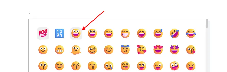
Then choose from the available Emoji icons:
The Emoji is inserted inline inside text: